
Docs Builder
Builder: Layers
On this page
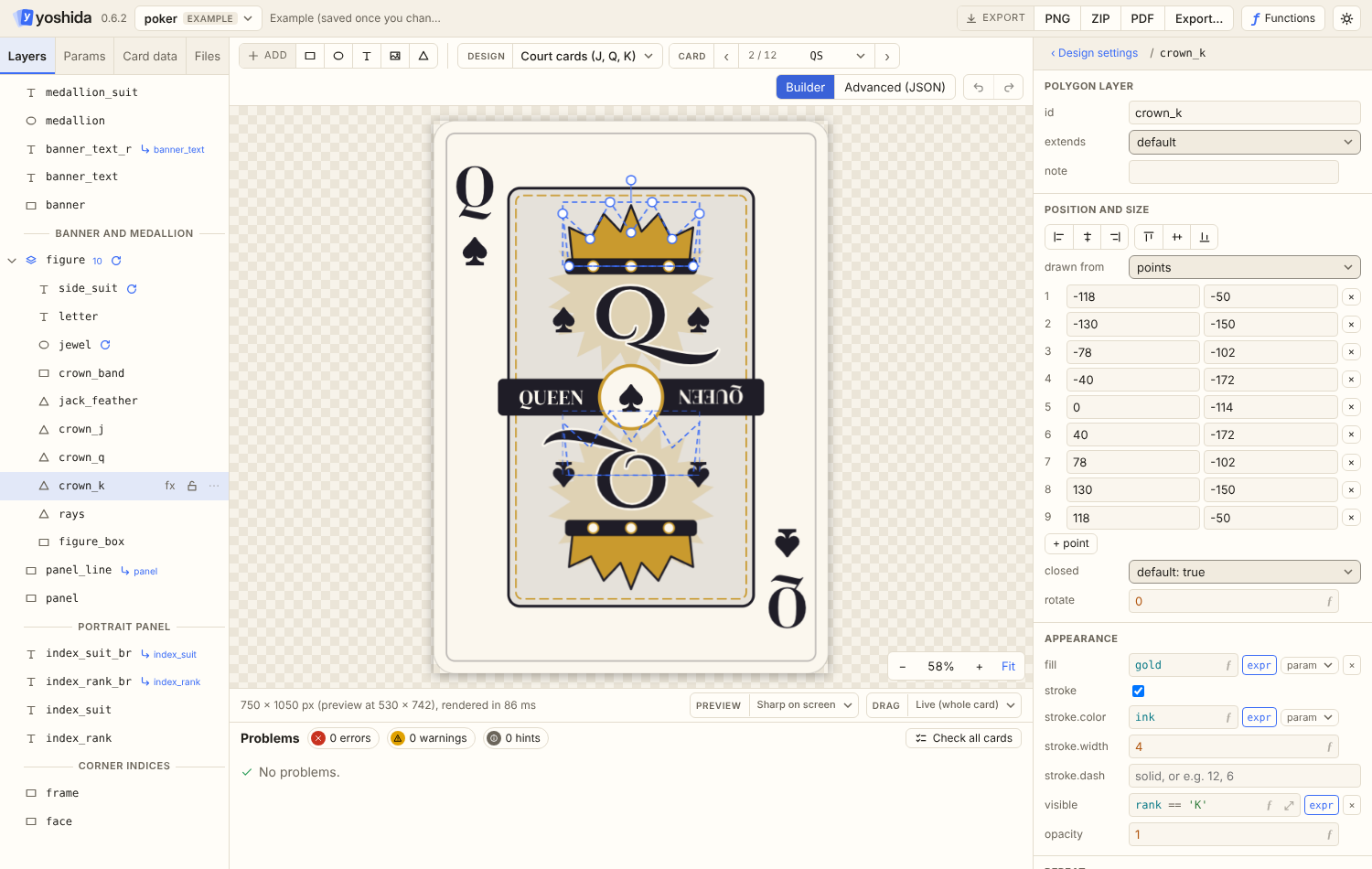
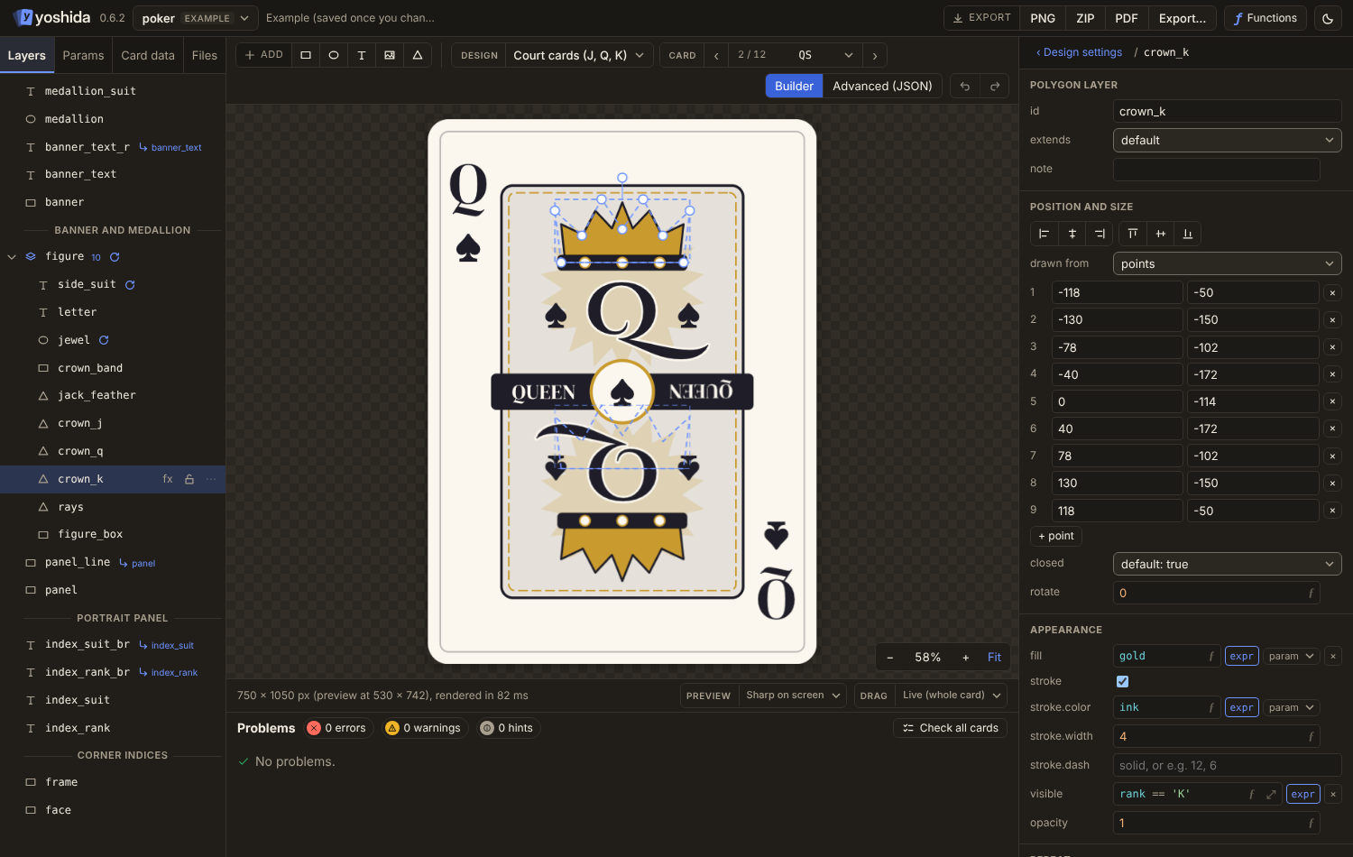
The Layers tab lists the design's layers topmost first, as a tree.
The tree
- Groups fold open and closed (▸ / ▾) and show how many layers they hold.
- Dividers (
"type": "divider") show as titled lines that organise the list and are never drawn. See Layer: divider. - Components are groups whose layers come from a shared component file. They have their own icon and colour (groups are blue), show the component's name, and fold like groups. The layers inside have a coloured rail: they are shared with every design that includes the component. See Components.
- The eye sets
visible. The lock stops canvas clicks (editor only). - Badges show the group size, repeat, extends, effects and problems. A group shows the worst problem inside it.
Selecting and reordering
- Ctrl+click and Shift+click select several layers.
- Drag rows to reorder, or drop onto the middle of a group row to move layers into that group.
- Ctrl+Up / Down moves the selected layer in the stack (see Shortcuts).
Adding
- The toolbar adds a rect, ellipse, text, image or polygon, centred and above the selected layer.
- Right-click on empty space (in the list or on the canvas) to add a layer, an empty group, a divider or a component.
- The Component button at the end of the Add bar lists the project's components and includes the one you pick.
Layer menu
Right-click a layer or use the ⋯ button:
| Item | Does |
|---|---|
| Rename | Renames the layer and updates every @id reference and extends |
| Duplicate | Copies the layer (new id with a suffix) |
| Copy / Cut / Paste | Through the system clipboard, see below |
| Group / Ungroup | Wraps the selected layers in a group, or dissolves a group |
| Bring forward / Send backward | Moves one step in the stack |
| Move out of the group | Takes a layer out of its group |
| Create component | On a group: moves its layers into a component file, see Components |
| Include a component | On an empty group: fills it from a component file |
| Detach from component / Open component file | On a component, see Components |
| Colour | Tints the row in the layer list, see Colour tags |
| Show / Hide | Toggles visible |
| Lock / Unlock | Editor-only lock |
| Delete | Removes the layer; asks first when other layers refer to it |
Groups
Ctrl+G groups the selected layers: the group goes where the topmost of them was, and keeps their order. Ctrl+Shift+G ungroups. Moving a group moves every layer in it. See Layer: group.
Components
A component is a set of layers kept in its own file, so several designs can share it (an effect row, a cost badge). In the design it is a group with include.
- Create: right-click a group and choose Create component (or use the button in the inspector). Name it; the group's layers move to
components/<name>.component.jsonand the group includes that file. The card looks the same as before. - Include: use the Component button of the Add bar, Component… in the empty-space menu, or Include a component… on an empty group. A component already in the design, or one whose layer ids are already used, is greyed out with the reason.
- Edit: the component's layers are listed inside its group. Select one in the list, or double-click it on the card, and change it in the inspector or on the canvas like any layer. The change is written to the component file, so it shows in every design that includes the component; the inspector says how many other files use it. Undo covers these edits.
- Move, hide, repeat, lay out: changes to the component's group itself (its
translate,visible,repeat,layout, effects) stay in this design. Dragging a component on the card changes the group'stranslate, never the shared layers. - Detach: Detach from component turns the group into a plain group with its own copy of the layers, for a one-off variation. The component file stays.
- Duplicate or copy a component and the copy is a detached, plain group with renamed layers, because a design can include a component only once (layer ids are unique in a design).
The builder does not show live values or field errors for layers inside a component yet; problems in a component still mark its layers in the list and show in the Problems panel.
Colour tags
The layer menu (right-click a layer) starts with a row of colour dots: one click gives the selected layers one of nine colours, and the empty dot with a stroke removes it. The dot of the current colour has a ring. The colour tints the row's background faintly and adds a stripe on its left edge, so it does not compete with the icon colours. It is saved in the design as the layer's tag (for example "tag": "green"), travels with the project, and is never drawn on the card.
Copy, cut and paste
Ctrl+C, Ctrl+X and Ctrl+V work on the selected layers through the system clipboard, so layers move between designs, projects and even browser tabs. Pasted ids get _copy added, and @ references among the pasted layers follow the new ids.